eBusiness Weekly

Leslie Mupeti
Rebranding is a natural part of a company’s life. Trends are always changing and so companies have to constantly keep evolving to be able to keep up with the changing times.
If done right, a rebrand may freshen the company’s image (as did ZIMNAT) but if poorly executed, it might seem like a lazy approach to catch up with the trends. If not done right a rebranding campaign will appear to customers as a “fixing-what’s-not-broken” waste of a company’s funds. Rebranding is a tricky process, but it is inevitable.
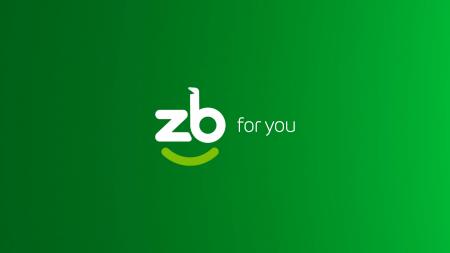
We have all seen the new ZB Bank logo and from my perspective as a brand strategist and graphic designer I would say that it is “meh”.
ZB Bank is one of the biggest and oldest banking institutions in Zimbabwe with a history dating back to 1957 when they were called the Nedtherlands Banks of Rhodesia before changing to Rhobank.
I would think that a financial institution with so much heritage and history behind it would strive to communicate that to its customers through its branding and design.

The new ZB logo
They have, however, decided to do away with this heritage and decided to assume a trending “fintech-startup” look. Following logo design trends is important but brands must be aware of sacrificing individuality of their brand just for the sake of it.
Brands need to think of cool ways to show their character without going overboard. The new logo makes use of a rounded comic sans font.
I would say it’s much like the old logo except they got rid of all the sharp edges and they took a complete 360 when it comes to their colour choices. My first criticism of this logo is that it lacks contrast, the new logo is just too green.
They could have made use of a darker shade of green (or any color which is not green) just to add more contrast.
My second issue with this logo? Yes, you guessed it right, the smile icon. I would rank this icon as one of the top ten most used icons in the world as far as logos are concerned.
The fact that a whole financial institution with tons of heritage and history decides to make use of this overused icon for its own logo is really mind boggling.
While it’s not really a bad icon, the fact that companies like Amazon, Eazi pools, Colgate and Senditoo use this same icon means that as far as brand differentiation is concerned, they are not really different from everyone else.
As far as the font is concerned they decided to go with a rounded comic sans font which is cool, sleek, modern and tech-saavy. This font is a great fit for tech-companies, fashion brands and startups.
There is a lot of risk associated with rebranding a business due to the equity the company built over time. If a logo redesign goes wrong an established entity can lose big money (all the company’s material needs to be replaced) as well as a loss in revenue.
A failed rebranding can confuse customers, lose a company money and eventually lead to a company reverting back to their old logo or redoing the entire process. Doing an established company rebrand is different from doing a startup company logo design. There is a lot on the line for an established brand.
People on social media were commenting on the logo with some saying that the logo was giving strong “National Building society” (NBS) vibes, apparently the two organisations have the same colour scheme and almost the same font.
Some were calling it an emoji, with one user commenting that at first glance the logo looks like a winking face which is what they will do when they tell users they have no money left in their bank accounts.
According to Arek Dvomechuk bank logos are supposed to be conservative. They must indicate trust and reliability not some dopey internet design trend that’s been done since the 2010s.
Minimalism is seeing a surge in popularity in the world of logo design and that’s one thing I like about this logo. It’s very simple. I’m sure it is going to work well in different applications of different sizes.
Logos are a very tricky bit because a logo might look ugly on paper before it is applied anywhere else and then go on to look fantastic when it is applied on a deliverable such as a T-shirt or a billboard. In this case, time will tell whether this new direction will be embraced in favour of their old identity.
◆ Leslie Mupeti is a graphic designer and brand strategy expert. He can be contacted on +263 785 324 230 and [email protected] for feedback.


